Category
FoodTech
Date
2021 – 2022
Role
Product Designer
Rocket - Food Delivery
Rocket food delivery mobile app, where I worked as
a product designer on redesigning the main screen to make it a delightful, modern app that works equally well for everyone.
Rocket Food was a Ukrainian food delivery service that aimed to compete with larger platforms like Glovo and UberEats by focusing on faster delivery times. The service initially concentrated on a smaller market to optimize its logistics before planning to expand further

PROBLEM STATEMENT
Keep Rocket’s identity recognizable while improving usability and adapting the design for expansion to new international markets
BREAKDOWN OF THE PROBLEM
Redesign main page
With company goals focused on growth, redesigning the main screen – where users first engage – becomes essential, offering a valuable area for improvement and user experience enhancement.
Keep the app simple and enjoyable
Make the app easy to use, so seasonal riders can quickly find and use the features they need without any hassle.

The starting point of our redesign was rooted in three core sources of data, giving us a solid foundation to build on
Key takeaways
1
Competitor analysis
2
Business requirements
3
User feedback and analytics on the current screen
COMPETITOR ANALYSIS
Conducted an in-depth analysis of competitors' solutions, paying close attention to their main pages and how users interact with content
At that time, I knew our main competitors in the Ukrainian market (Glovo, Bolt Food) and the leaders in Europe (Uber Eats, Takeaway, Wolt) quite well.
Evaluated two important factors:
1
Homepage layout and visual solutions
2
Functionality

Our analysis highlighted that Rocket lacked several key features other delivery apps offered. A quick redesign wouldn’t solve this gap. So, we took on an additional challenge – to redesign the main page in a flexible way that would make future feature updates easy and seamless.
The insights I gained were crucial for presenting and explaining the concept to stakeholders. The insights I gained were essential for presenting and explaining the concept to stakeholders
They also helped me better understand the key expectations that users have developed within the food delivery market. I carefully considered how these would affect the product’s performance, support future experiments, and enable growth.

BUSINESS REQUIREMENTS
The redesign wasn’t just about giving the homepage a fresh look
Beyond maintaining the uniqueness of the home screen, I also considered how the redesign would impact product metrics and future growth. This included allowing for product experiments and ensuring scalability, in line with the company’s long-term strategy. From the first second, it needed to make the brand recognizable, evoke emotions in users, and reflect the product's tone of voice.
Key product metrics:
1
Activation Rate
2
Engagement
FEEDBACK FROM USERS
Our insights came from usability testing, feedback from users in the App Store and Play Market, and reports from customer support
By then, we had a clear picture of the main problems to solve.
The key problems were as follows:

🔻 Monthly drop off rate was 26%
According to our analytics, we faced a key challenge: many users were dropping off right after reaching the main page, without even making it to the restaurant list.
DESIGN GOALS
Challenges the redesign intended to solve
The problem, and at the same time an area of growth, was the loss of users on the home screen.
🏄
Flexible
The design had to fix the limited layout for further scaling.
🪄
Scalable
Ability to customize the home screen for further product and marketing experiments.
🦄
Usability
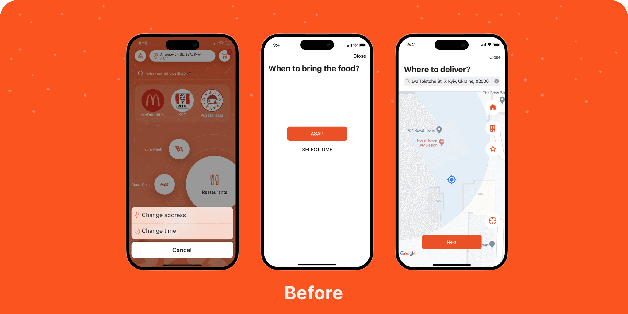
Simplified address, delivery times and on improving the clarity of categories and restaurant choices.
GENERATING IDEAS
I started working on ideas for scaling and quickly delivering value to users via wireframing. Engaging the development team early on helped to identify potential technical blockers, ensuring smoother implementation down the line.
SOLUTION
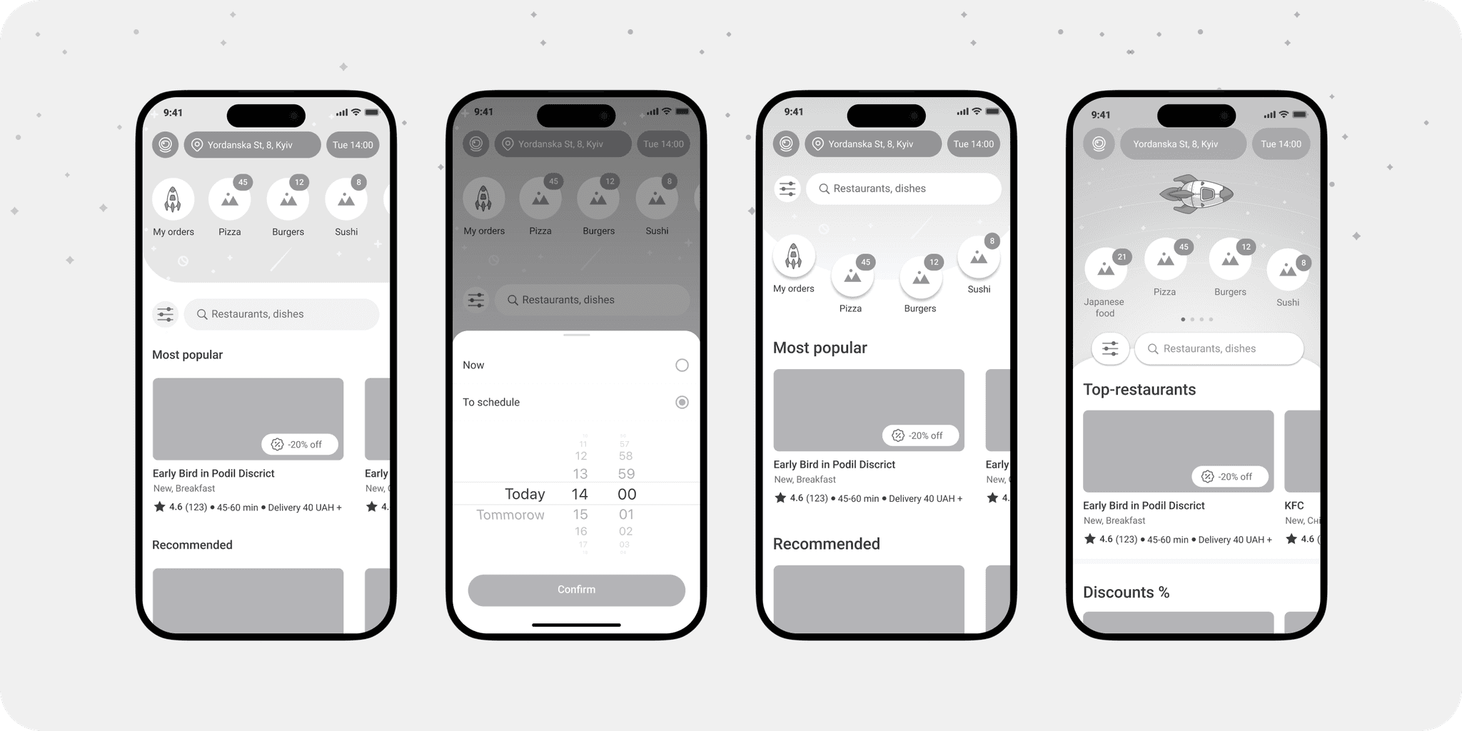
Show the list of restaurants at once
Reduce mental effort for new users by making the app’s focus clear. Showing photos of food places works much better than asking users to read labels and figure out category icons.

DESIGN GOAL: FLEXIBLE
Horizontal scrolling for categories makes it easy for users to see more options on one screen
Before, users saw only three types of offers and had to tap extra to view each one. This layout not only solved the flexibility issue for product but also allowed new blocks to be easily added to the existing structure and tailored to users' needs and previous orders.

DESIGN GOAL: SIMPLE
Simplify choices by categorizing by kitchen type
This solution met users' needs by making it easier to choose a place and speeding up the entire ordering process. By the way, the icon slider became one of the key features of the new design.

DESIGN GOAL: USABILITY
Selecting the address and delivery time
I’ve simplified the address selection process. Instead of having to pick an address on the map and go through a long input and confirmation process, users can now quickly choose from a list of recently used or saved addresses.